
Introduction
All code can be found by registering for our code templates here at the bottom of the page.
We have all heard the cliché that diversification is the only free lunch in investments. And in technical terms we would normally define diversification as adding investments that have less than perfect correlation with our other assets. And the more negative the correlation the greater the risk reducing aspects of the new asset. That’s why we created the 60 equity 40 fixed income balanced portfolio. The fixed income is designed to provide low correlation assets to our equities and reduce portfolio volatility. But do bonds really offer lower correlations, or at least enough to meaningfully reduce portfolio risk?
Not All Bonds Are Created Equal
We would like to think that adding fixed income to a portfolio will reduce our risk profile. But ask yourself the following questions:
what is the current correlation of fixed income to equity?
Which fixed income investment do we use as our proxy or our target asset?
Over what period should we measure correlations?
If you can’t answer these three questions, then you haven’t done enough due diligence.
Here is a basic process, with Python code, that you can use to help start answering these questions.
Government Bonds vs. Corporate Bonds
Just like equities can be dividend into growth and defensive, we can do the same for fixed income.
For fixed income, one of the basic categorizations we can use is government issued debt vs. the debt issued by corporations. We would expect these bonds to behave differently as they will be affected to varying degrees by economic factors.
What many investors forget, is that corporate bonds are highly correlated to equities because when economic difficulties hit companies, they could have trouble paying interest and paying off their debt. So, we would expect corporate bonds to be more highly correlated to equities than equivalent government bonds. That’s why corporate bonds trade at higher yields to equivalent government bonds with the same maturity. That’s what we call credit spreads (note: the term credit is used interchangeable with corporate bonds).
So, then let’s start with question 1: What is the current correlation to equities for fixed income?
We will use SPY as our equity asset class. For fixed income we will use:
LQD: An ETF containing investment-grade, liquid corporate bonds.
IEF: AN ETF with US government bonds with maturities between 7 and 10-years.
AGG: An ETF that replicates the US bond universe, containing both government and credit.
The AGG is one of the most common benchmarks used for US fixed income and is used to provide instant diversification across the entire US bond universe. This answers question 2. We will use multiple bond sectors and investigate their correlations to SPY.
But to answer question 1, you need to answer question 3 first.
One error I see constantly from investment professionals is using a point in time estimate of correlations based on since inception data. This is so misleading. You cannot assume that historical relationships will hold in all periods of time. Investment companies can cherry pick the time period to make their case that their new and great investment fund offers low correlation.
One possible solution is to look at correlations over rolling periods, and then get a sense for the range of correlations over time and what economic factors explain those correlations. The goal is to give you a sense of possible changes to portfolio risk profiles if bond correlations spike and no longer offer the diversification benefits you were hoping for.
Rolling Correlation Analysis
In this case study, we downloaded prices for our 4 ETFs and converted them to monthly returns (all python code is available here). We then created a function to calculate the rolling correlations against our ticker of interest (SPY) over any rolling window you want. We will start with rolling 3-year periods (36 months).
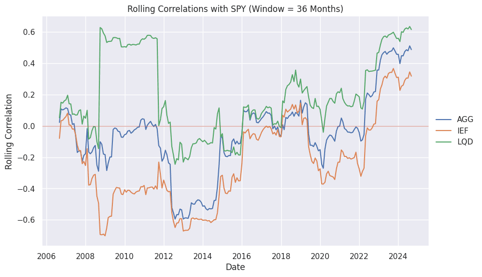
Figure 1 shows the rolling 3-year correlations for all three of our fixed income asset classes against SPY. You should be immediately able to make some interesting observations.
LQD is much more highly correlated to SPY than the AGG or IEF (it spends most of the time above the zero line).
Unsurprisingly, the AGG is in the middle of LQD and IEF. It does contain a mix of both.
Government bonds seem to have historically offered the most diversification benefits.
All fixed income is currently very highly correlated to equities over rolling three-year periods!
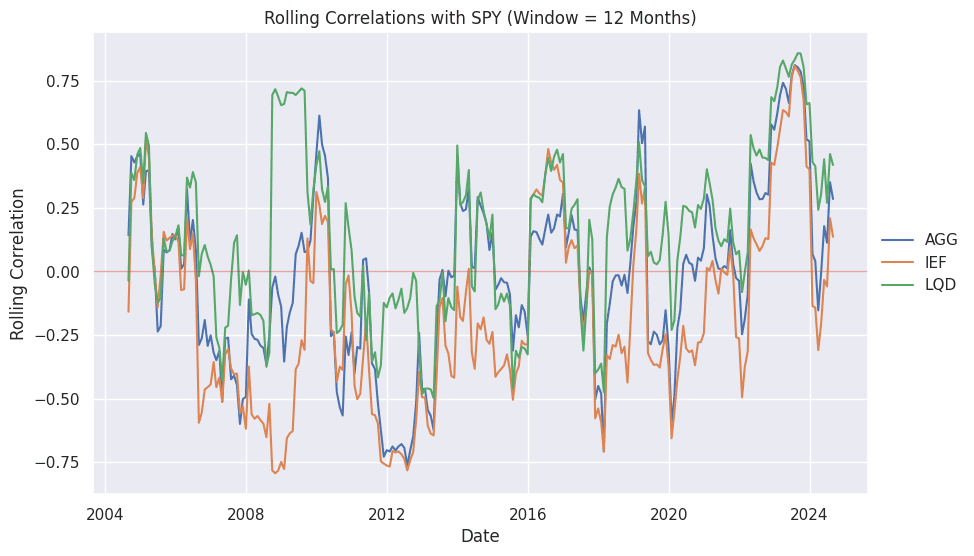
Ok, but that is over a rolling 3-year period. What if we reduced it to one-year. Figure 2 shows the results. We should intuitively expect greater changes in the correlations given the shorter time period. We can also see that the correlations are starting to normalize and come back down to historical ranges and fixed income diversification benefits appear to be improving.
However, using rolling one-year periods is better for tactical asset allocation and making short-term positioning decisions for a portfolio. Portfolio construction typically takes a longer-term view.
So then what would rolling 5-year correlations look like?
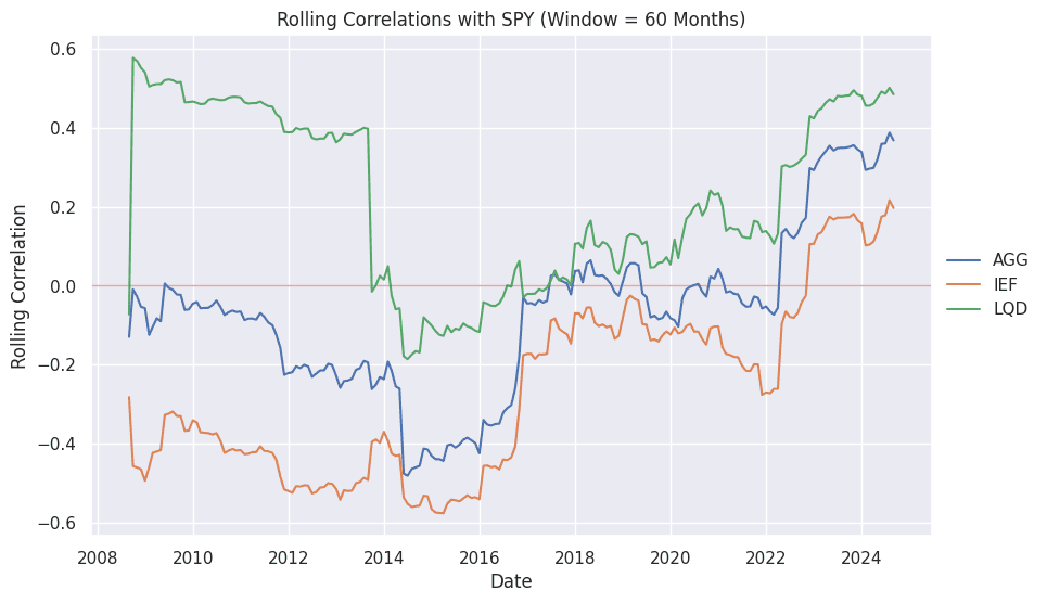
Figure 3 shows the rolling 5-year correlations, and we can see the same patterns. Over longer periods, we don’t expect to see the high readings we can get with shorter time periods since the correlations do tend to come back to a historical range once economic shocks are absorbed. But we can clearly see that if you really want to add diversification, you need government bonds. But even those don’t offer as much diversification as we would like all the time.
Fixed Income Correlation Ranges
These rolling analyses and plots are very informative and powerful. But they don’t answer a key question:
What is the average correlation of two investments using rolling periods and where are we now compared to that average?
Figure 4 is a plot that we created to answer that question. It is a novel way to show the range of values within a time series, identify the values that would fall in the extremes (values within the 5th percentile region or 95th percentile region), and tell where you are today compared to the mean value. The figure shows the rolling correlations for SPY and IEF.
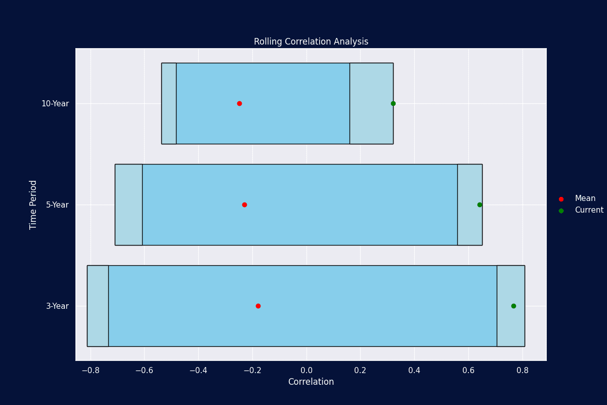
We think you will agree it is a powerful chart for time series analysis! We can also see that in our 3, 5, 10-year periods, we are sitting in the 95th percentile region, and in some cases, at the most extreme values we’ve ever seen!
Note: The code for the range plot is not provided in the notebook. It is available in our courses to all subscribers.
Conclusion
And there you have it. Not all bonds are created equally. And you must get a better understanding of how fixed income behaves if you are to truly understand the diversification benefits offered by various investments. The process and code provided here can be used for any asset class in your investment due diligence and portfolio construction workflow.
One key takeaway here, is that you should see why liquid alternative investments have become very popular. If you can create an alternative asset class with similar risk-reward characteristics (like fixed income), and offer low correlation, then that is a clear winner in portfolio construction.